
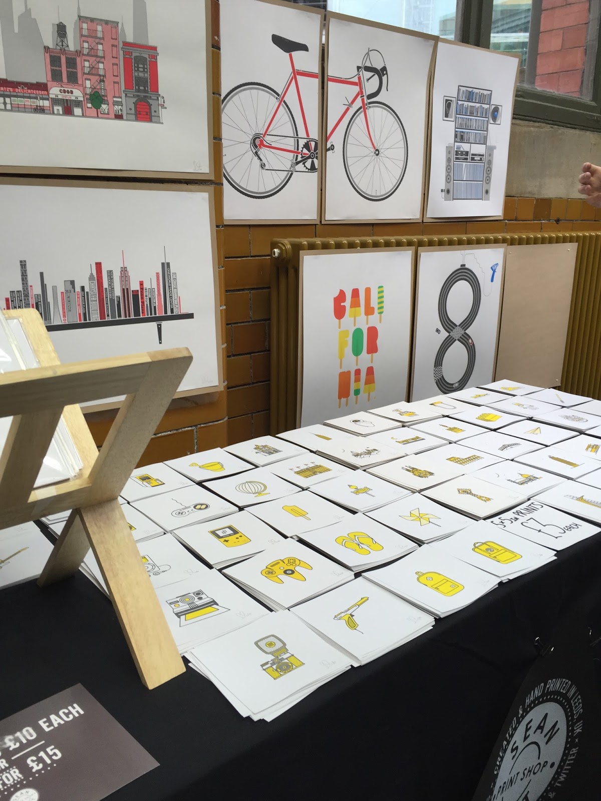
I took a day trip out to Manchester to visit the Manchester Print Festival at the People's History museum.

There was some really inspiring work there, like below, which was very typographic based combining bold sans serif type with textures to make them look almost chiselled and 3D. I particularly liked the boldness of the type on its own when it was enlarged.


I really liked this stall run by two people who study on the Graphic Design course at Manchester School of Art. Their work was really abstract and in a lot of their prints they use special screen printing effects such as marbling and blending the inks. The use of the almost neon colours against the stark white background really makes them pop. I bought one of the prints for myself and it is now hanging proudly on my wall.


I also fell in love with this risograph book and I regret not buying it now. It was a photography book full of images of shutters of shops when they are closed. They printed it using a risograph printer so it was printed one colour at a time. So when you looked closely at the pages you could see the grains of each of the colours C, M, Y and K. It really was beautiful and every page quite interesting despite the bland subject.
No comments:
Post a Comment