THE RIVALRY is a collaboration of opposites who share a discerning eye. While we are inverses of each other, our collective strengths exceed our differences. This duality lies at the center of everything we do. The studio is owned and run by JESSE KACZMAREK and ANDY GUGEL—each a leader in their creative field (BRAND and DIGITAL, respectively)—with offices in NEW YORK CITY and MINNEAPOLIS. Together we create engaging experiences with clients who champion the potential of design.The Rivalry's design is the sort of design that I appreciate the most. It's refreshing, simple and to the point design that almost seems effortless. Simple colour schemes and contemporary typefaces give an overall aesthetic of cleanliness inviting the user to pick them up. The most notable of their recent designs is the Google rebrand.
Caviar Identity
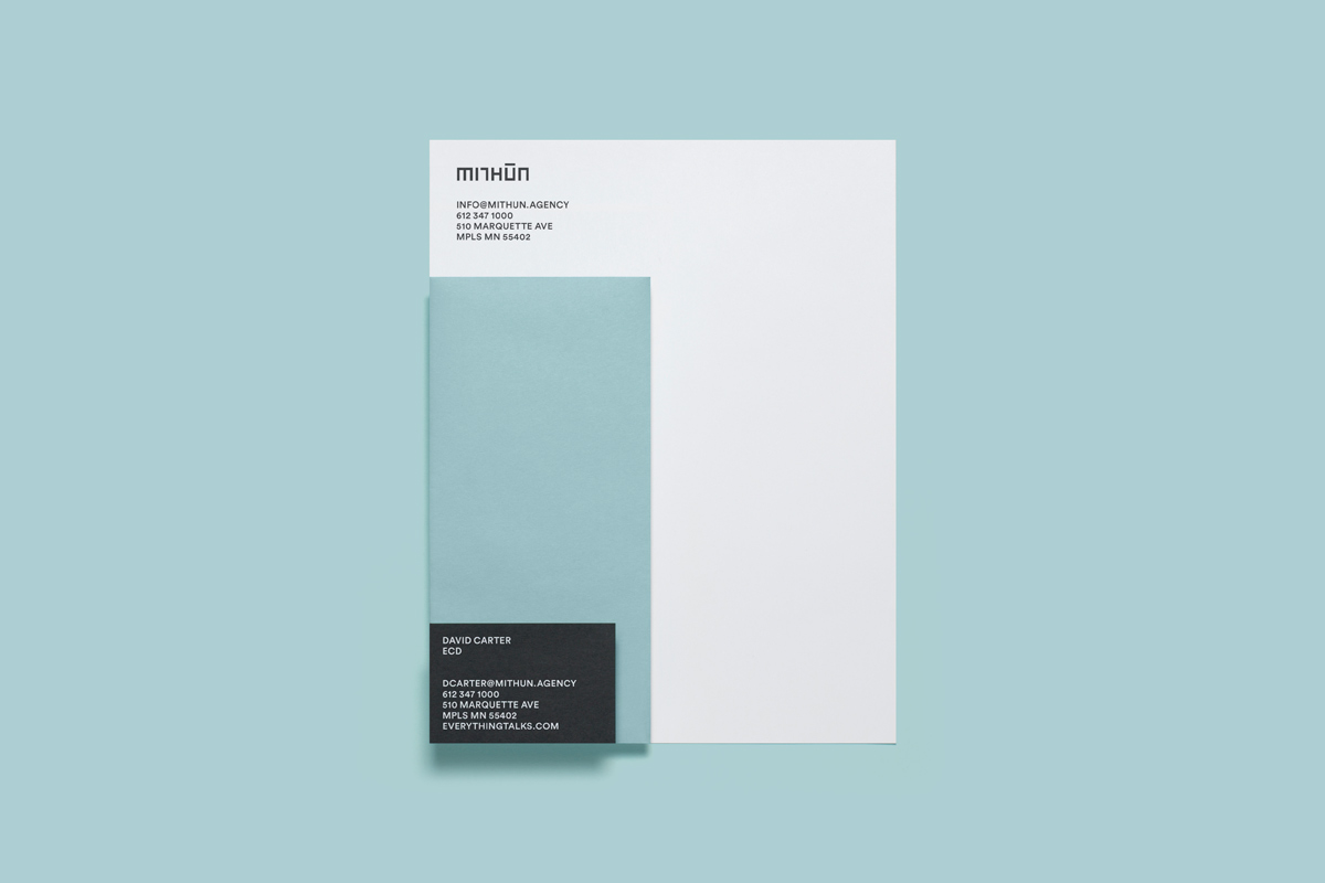
Mithun Identity
This sort of identity really appeals to me because of it's simplicity in just a logotype rather than over complicated symbols. The restraint shown for the colour palette further adds to the sophisticated feel of this identity. I also feel like the layering of stock in the stationary plays a big part to its success. As the design is not simply a flat page, it has elements that move making it more visually appealing.
http://therivalry.co/
https://www.behance.net/TheRivalryInc


No comments:
Post a Comment