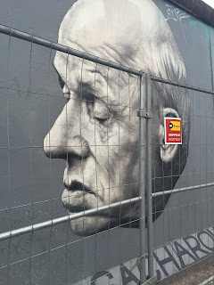
Here are just some of the highlights of the trip to Berlin with Uni. I really enjoyed the atmosphere of the city as a whole and how open it was. I would definitely visit again so I could go to see all the things that I missed out on.
The Bauhaus Archiv
As a group we visited the Bauhaus Archiv, the building itself was very architecturally relevant to the era and I particularly liked the use of white buildings so that the shadows could almost paint an image onto the side of them depending where the sun was shining. In the actual museum we were not allowed to take pictures but I did find the contents very inspiring. I found it interesting seeing the roots of the Bauhaus movement as well as pieces by some of the main founders. It definitely made me want to look more into this aesthetic in graphic design.
Tiergarten
The Tiergarten itself was beautiful purely from the size of the park, it was like a little oasis within the centre of this huge city. I love walking through nature filled spaces like this as they really inspire me and clear my head. One thing that I noticed when walking about was that a lot of people seemed to carve into the tree bark. And in some cases I think it was done by the same artist carving quotes or lyrics into the bark.
This particular tree had the lyrics for "Stand by Me" carved into it. The organic-ness of the bark vs the hand rendered type really adds to the aesthetic of these quotes. This makes them seem almost like they were supposed to be there.
The Holocaust Memorial
The Holocaust Memorial was harrowingly beautiful. I got very emotional walking through the pillars with them getting taller and taller around me. I felt as if I was being closed in, being a small ant amongst giants. I can't imagine what people must have felt like going through this era. The museum underneath was equally as moving, reading some of the stories from survivors and letters that managed to get out of the camps were truly awful.
The Berlinische Galerie
I absolutely loved everything about the Berlinische Galerie, the architecture, the sculpture outside and the huge empty room with crossing stair cases and the work itself. Heidi Specker was exhibiting there for most of the ground floor and I found her photographs enchanting.
Heidi's series showing tree trunks against modern buildings was definitely my favourite of all of the work within the galerie. I love how isolated the trunks looked against the buildings as well as the colour combinations that it created. My favourite was this birch trunk against the lilac building in the backdrop. The colours go so well together it looks like a match made in heaven.
I also loved these close ups of architectural structures made up of board marked concrete. It almost links with her photographs of the trees and architecture but in a distant way. The board marked concrete combines nature and architecture very literally, showing the patterns of the wood onto the set concrete.
Some more images of Heidi Specker's series, each as interesting as the last.
I was really taken by one of the portraits in another part of the gallery. I love how the portrait is not finished, the brush strokes feel rushed but I feel like there is more movement in this one little unfinished painting than in any of the finished pieces. You can almost see the artist placing the brush strokes in your mind.
There was also some very constructivist paintings using colour and shape. I love the colour combination that has been used in the image on the right in particular as it gives a calming aura. Where as the other painting jarrs the senses because of the bright hues and bold contrast between colours.
There was also two very abstract pieces that I admired quite a lot. The blue piece reminded me almost of marble or even a turbulent sea. With the colour palette being so natural it didn't feel random at all. And the other piece combined images with paint thrown on top of it to create a bold effect. It almost looks like propaganda combined with graffiti.
Do you read me?!
We also visited an artist bookshop called Do you read me?! which was full of very inspiring books and magazines. There was almost too many magazines to choose from! It was nice to just go and flick through various magazines that I have heard of but never seen in person before.
East Side Gallery/The Berlin Wall
One of the last things that we did while in Berlin was to visit the Berlin Wall and the East side Gallery (which is basically the wall itself). I loved looking at all of the grafitti around the city so to see it concentrated onto one long strip was amazing.
There was a lot of quotes and poems that really spoke to me along the wall. The two above being the most prominent. A lot of the messages of the paintings on the wall seemed to be asking for peace and not war. I find it sad that the human race has not learnt from its mistakes and is still constantly at war rather than being one united species.


No comments:
Post a Comment