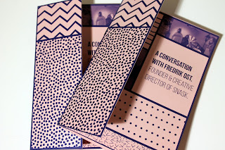
Here is the photographs of my completed Creative Report. I want to send one of the copies back to Fredrik Ost as a little thank you for him answering my questions. However the two prints that I did have small gaps in the lines because I didn't put enough bleed on them. So I might have to print off another copy in order to mail to him because I really want it to be perfect!
I'm really pleased with the outcome of the cover and half cover. It didn't really come out well in these photos but the stock used for the half cover shines under the light and adds that extra bit of luxury to the little book.
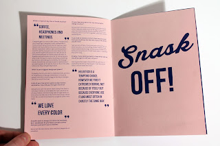
This is my favourite spread of all of the pages because I just love this quote and the man himself! I think that the use of the portrait with bold type on the pink stock has combined to make a really nice effect.
Overall I am really pleased with the outcome because I feel like it successfully portrays the nature of Snask which is what I was going for. My time management for this brief has been really good - I got the interview questions back in December so I had plenty of time to design it and I didn't feel rushed. I think the fact that the interview really inspired me helped with finishing this fairly quickly. I seem to finish things quicker when I enjoy making them. However lack of hindsight caused the print to be a bit off so I think for my next projects I need to do more mock ups before printing off the final thing as I am going to have to print out the booklet again on different stock.


No comments:
Post a Comment