Throughout the second year I feel like PPP has helped me to realise finally what designer I want to be and what goals I want to achieve within my career. In taking care of business I benefited from finding new studios that I liked and hearing other peoples thoughts for their future. It is just generally inspiring working with other people in a collaborative way. Yet I do feel like I could have done more for the presentation. The creative report helped me massively as a person and a designer to realise what to do after graduating. Fredrik Ost said that it's best to be yourself and not change for anyone so this is what I'll do for the future. I feel like I should work on my strengths within design rather than trying to broaden my horizons in order to be more likely to get a job. I realised that if a studio was looking for someone they would pick someone with a specialism and not someone who is a generalist. Having talked to him being one of my idols I definitely feel more confident in approaching designers and just having a chat rather than thinking they will bite my head off if I ask anything. Also revisiting my branding made me see how much I have progressed as a designer in the short space of a year. I feel so much more confident with everything now and I hope this confidence boost will continue through to level 6. As a person I am better at presenting now and especially being part of more collaborative briefs I have found that I do have group leading skills that I never really knew that I had.
Overall throughout the module I feel like I have engaged with every part of PPP that I can. The only thing that I don't feel like I have engaged with enough is looking for studios to do a placement at over summer. However now I have got the role of Communication's Officer role at the student union I will be working on the Fresher's material over summer which will be a challenge in itself. So I am still unsure about what to do with myself this summer. I am kind of disappointed that the PPP module has ended so early this year as I feel like I could have done a lot more with it.
For next year I plan to revert back to doing the design that I am really passionate about. I haven't done much packaging design at all this year because I thought that I wanted to focus more on branding. But I found that branding and packaging can be heavily linked. I definitely want to do more packaging next year. Also I want to continue to pursue my interest in traditional print methods. With the opportunity of designing the future fresher's collateral I think I will try out more sustainable methods of design too, including risograph printing which uses soy based inks so it is a lot better for the environment than most printing processes.

Thursday, 17 March 2016
Saturday, 12 March 2016
OUGD502 - Berlin Trip
Here are just some of the highlights of the trip to Berlin with Uni. I really enjoyed the atmosphere of the city as a whole and how open it was. I would definitely visit again so I could go to see all the things that I missed out on.
The Bauhaus Archiv
As a group we visited the Bauhaus Archiv, the building itself was very architecturally relevant to the era and I particularly liked the use of white buildings so that the shadows could almost paint an image onto the side of them depending where the sun was shining. In the actual museum we were not allowed to take pictures but I did find the contents very inspiring. I found it interesting seeing the roots of the Bauhaus movement as well as pieces by some of the main founders. It definitely made me want to look more into this aesthetic in graphic design.


Tiergarten
The Tiergarten itself was beautiful purely from the size of the park, it was like a little oasis within the centre of this huge city. I love walking through nature filled spaces like this as they really inspire me and clear my head. One thing that I noticed when walking about was that a lot of people seemed to carve into the tree bark. And in some cases I think it was done by the same artist carving quotes or lyrics into the bark.


This particular tree had the lyrics for "Stand by Me" carved into it. The organic-ness of the bark vs the hand rendered type really adds to the aesthetic of these quotes. This makes them seem almost like they were supposed to be there.

The Holocaust Memorial
The Holocaust Memorial was harrowingly beautiful. I got very emotional walking through the pillars with them getting taller and taller around me. I felt as if I was being closed in, being a small ant amongst giants. I can't imagine what people must have felt like going through this era. The museum underneath was equally as moving, reading some of the stories from survivors and letters that managed to get out of the camps were truly awful.

The Berlinische Galerie
I absolutely loved everything about the Berlinische Galerie, the architecture, the sculpture outside and the huge empty room with crossing stair cases and the work itself. Heidi Specker was exhibiting there for most of the ground floor and I found her photographs enchanting.


Heidi's series showing tree trunks against modern buildings was definitely my favourite of all of the work within the galerie. I love how isolated the trunks looked against the buildings as well as the colour combinations that it created. My favourite was this birch trunk against the lilac building in the backdrop. The colours go so well together it looks like a match made in heaven.

I also loved these close ups of architectural structures made up of board marked concrete. It almost links with her photographs of the trees and architecture but in a distant way. The board marked concrete combines nature and architecture very literally, showing the patterns of the wood onto the set concrete.


Some more images of Heidi Specker's series, each as interesting as the last.


I was really taken by one of the portraits in another part of the gallery. I love how the portrait is not finished, the brush strokes feel rushed but I feel like there is more movement in this one little unfinished painting than in any of the finished pieces. You can almost see the artist placing the brush strokes in your mind.


There was also some very constructivist paintings using colour and shape. I love the colour combination that has been used in the image on the right in particular as it gives a calming aura. Where as the other painting jarrs the senses because of the bright hues and bold contrast between colours.


There was also two very abstract pieces that I admired quite a lot. The blue piece reminded me almost of marble or even a turbulent sea. With the colour palette being so natural it didn't feel random at all. And the other piece combined images with paint thrown on top of it to create a bold effect. It almost looks like propaganda combined with graffiti.

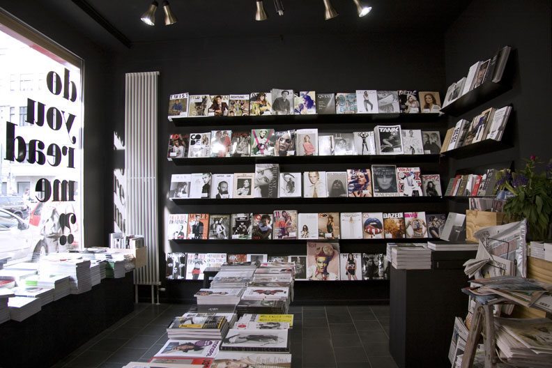
Do you read me?!
We also visited an artist bookshop called Do you read me?! which was full of very inspiring books and magazines. There was almost too many magazines to choose from! It was nice to just go and flick through various magazines that I have heard of but never seen in person before.


East Side Gallery/The Berlin Wall
One of the last things that we did while in Berlin was to visit the Berlin Wall and the East side Gallery (which is basically the wall itself). I loved looking at all of the grafitti around the city so to see it concentrated onto one long strip was amazing.


There was a lot of quotes and poems that really spoke to me along the wall. The two above being the most prominent. A lot of the messages of the paintings on the wall seemed to be asking for peace and not war. I find it sad that the human race has not learnt from its mistakes and is still constantly at war rather than being one united species.


Sunday, 6 March 2016
OUGD502 - Communications Officer Campaigning
I took the plunge and nominated myself for communications officer for the students union. I felt like it would be a really good experience to create professional designs and get them printed professionally too. Hopefully if I get the role I will be able to use these skills and the experiences in the industry so I'm that one step ahead of other designers recently graduating. I also really like the thought of being able to say that I made something at Uni - having my work up around University and getting all the exposure would be great.
So I started to design my campaign around my name. I thought that a more humorous campaign rather than one of a more serious nature would click with people better. So I played on my name giving myself the tagline "Hats off for Hattie" using hats as the main part of my campaign.. For the leaflets and posters that I will use I wanted to show my personality both as a person and as a designer so that people know what they can expect. So I went for something typographical yet quite illustrative to represent me.


So I started to design my campaign around my name. I thought that a more humorous campaign rather than one of a more serious nature would click with people better. So I played on my name giving myself the tagline "Hats off for Hattie" using hats as the main part of my campaign.. For the leaflets and posters that I will use I wanted to show my personality both as a person and as a designer so that people know what they can expect. So I went for something typographical yet quite illustrative to represent me.
Posters

Leaflets/Postcards
I illustrated lots of different types of hats for the back of the leaflets to relate to the tagline and hopefully it will bring a smile to peoples faces. Especially the fact that I added some silly hats into the pattern like the fez, party hat and deer hunter hat.


Saturday, 5 March 2016
OUGD502 - Design Strategy Presentation
I wanted to keep my slides for the design strategy presentation quite minimal and not too text heavy as I felt like I could talk through most of the points to go through. Also I used my updated branding to tie the whole presentation together and I think that the minimalism suits my revised logo and branding.
Presentation Slides


The feedback that I got from the presentation was really positive which was nice. It was picked up on how some briefs had informed some of my others. Like the Logo-starter brief informing my CoP essay. Also my tutors liked that I want to focus on client led briefs in the future because it helps to create a tough outer skin to other's views and opinions about your work. I think this is something that is essential as a designer because if you are not willing to take harsh criticism then there is no point designing for anyone but yourself.
OUGD502 - Studio Brief 1 - Creative Report - Final Photos & Evaluation
Here is the photographs of my completed Creative Report. I want to send one of the copies back to Fredrik Ost as a little thank you for him answering my questions. However the two prints that I did have small gaps in the lines because I didn't put enough bleed on them. So I might have to print off another copy in order to mail to him because I really want it to be perfect!


I'm really pleased with the outcome of the cover and half cover. It didn't really come out well in these photos but the stock used for the half cover shines under the light and adds that extra bit of luxury to the little book.


This is my favourite spread of all of the pages because I just love this quote and the man himself! I think that the use of the portrait with bold type on the pink stock has combined to make a really nice effect.
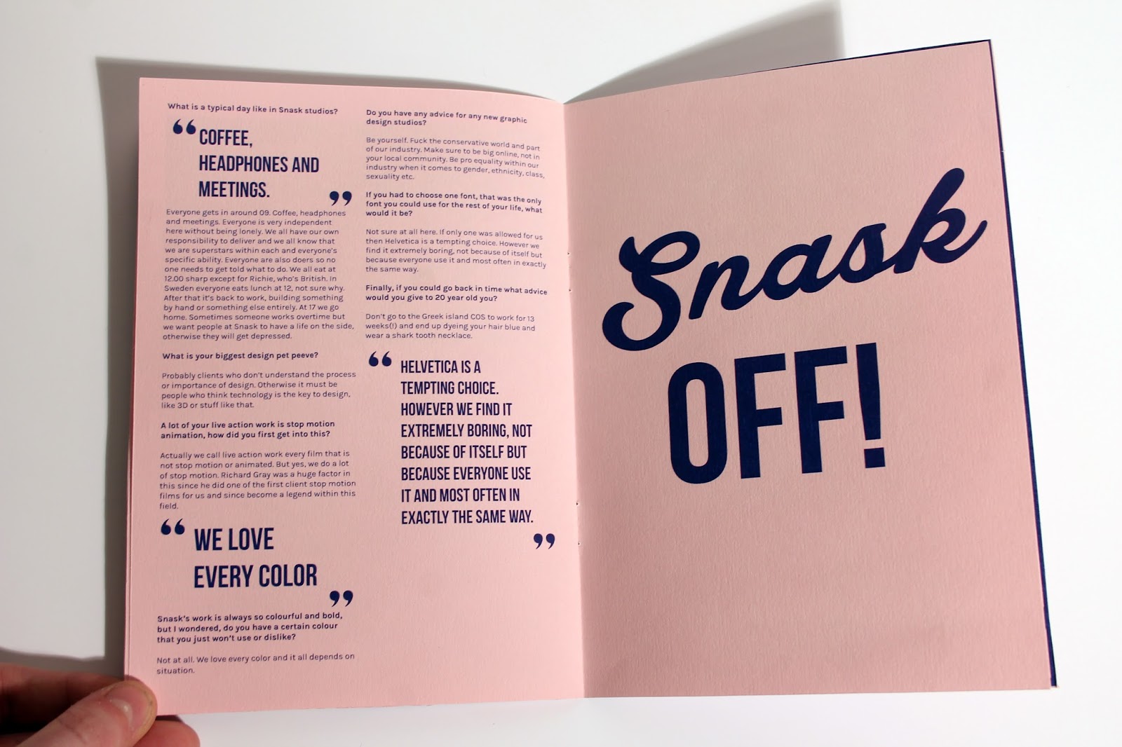

Overall I am really pleased with the outcome because I feel like it successfully portrays the nature of Snask which is what I was going for. My time management for this brief has been really good - I got the interview questions back in December so I had plenty of time to design it and I didn't feel rushed. I think the fact that the interview really inspired me helped with finishing this fairly quickly. I seem to finish things quicker when I enjoy making them. However lack of hindsight caused the print to be a bit off so I think for my next projects I need to do more mock ups before printing off the final thing as I am going to have to print out the booklet again on different stock.
Subscribe to:
Comments (Atom)