
We chose 5 key areas to explore within our practice and each chose one to research. I was very intrigued by the idea of interactive design - not digital but analogue. I really like the idea of being able to have something physical for the audience to react to - that communication between the design and the user.
Studio Roosegaarde
Van Gogh Path
https://www.studioroosegaarde.net/project/smart-highway/photo/#van-gogh-path
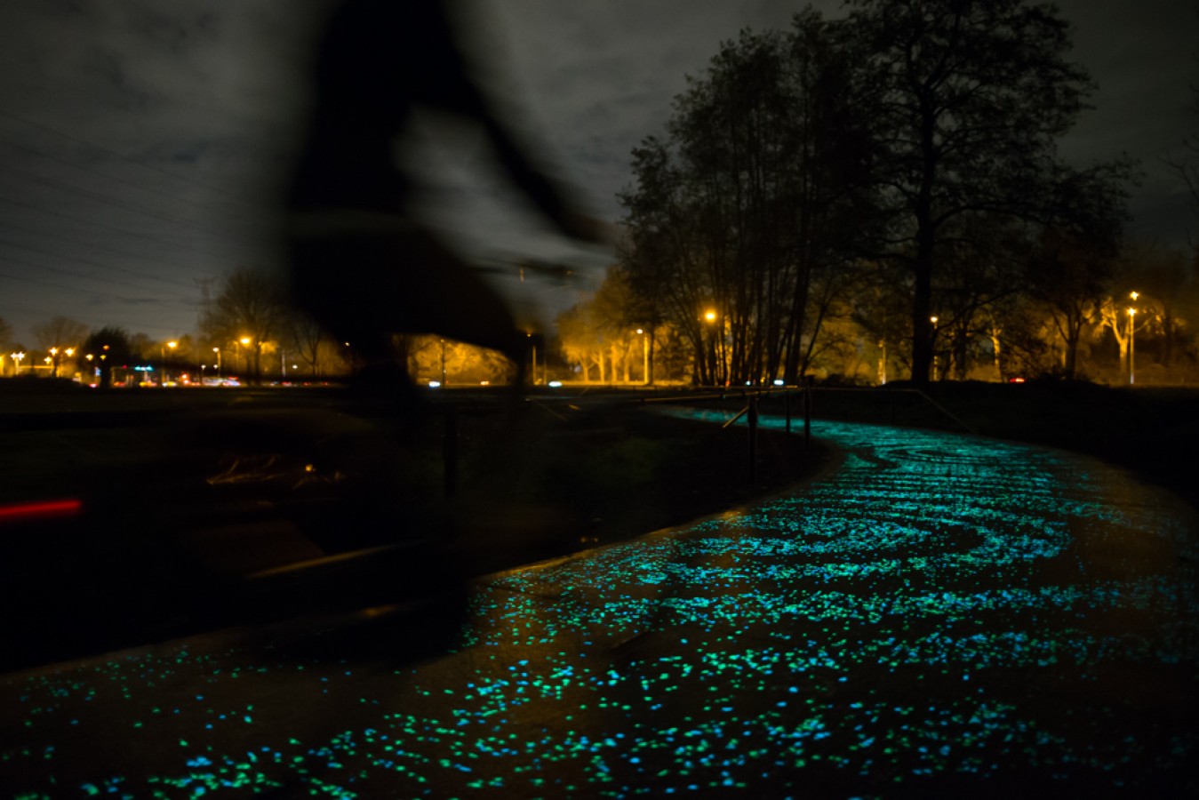
"SMART HIGHWAY are interactive and sustainable roads of tomorrow by designer Daan Roosegaarde and Heijmans Infrastructure. Its goal is to make smart roads by using light, energy and information that interact with the traffic situation.
Glowing Lines are lines that charge at day-time, and glow at night for eight hours. The first road has been realised, and will be further launched internationally.
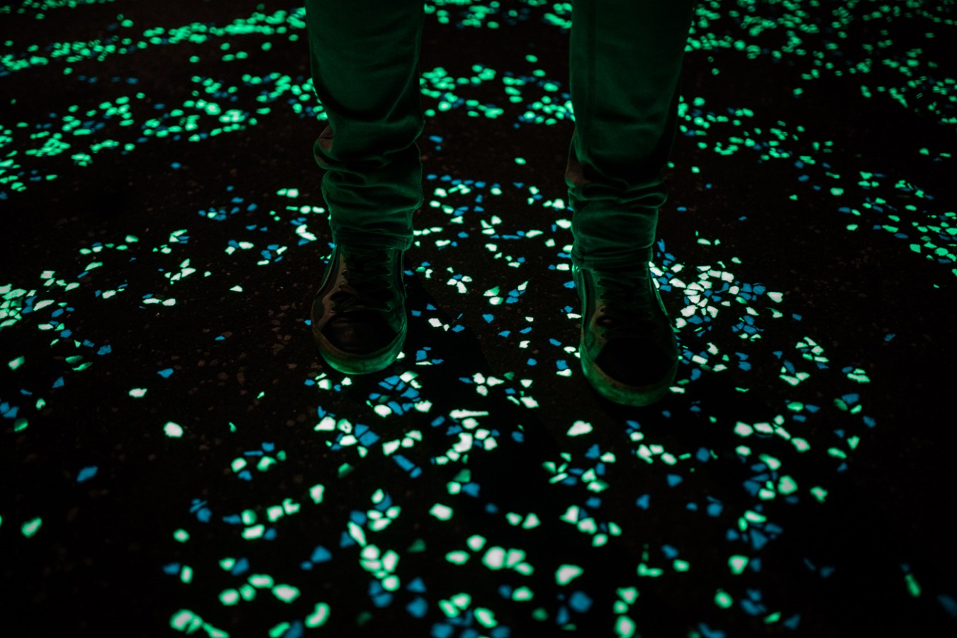
The recent Van Gogh-Roosegaarde bicycle path is made of thousands twinkling stones inspired by 'Starry Night'. The path combines innovation with cultural heritage in the town of Nuenen NL, the place where Van Gogh lived in 1883."
This path in The Netherlands was inspired by the Starry Night Van Gogh painting and it lights up as people walk across it. This means that the path wouldn't need any street lighting by it for people to walk safely as well as creating a beautiful feature to the town that would attract tourists.
Snask
Malmö Festival 2014


http://snask.com/case/malmofestivalen-2014/
Another piece of brilliant installation design is this 3D poster for a festival in Malmo. I love how the set up was used as the poster and then kept throughout the event so that people could constantly react with it and walk within it. This interaction between design and clientele is exactly want we want to portray in Roots. Snask do a lot of this sort of playful design where they use physical objects within the design rather than being purely digital. It really makes a difference to have real objects that are photographed as opposed to digital vectors. Real objects add a texture and a tactile-ness that could hardly ever be achieved digitally.
Christian Hergarten
The 2€ T-shirt Machine
https://www.behance.net/gallery/26017969/THE-2-EURO-T-SHIRT-A-SOCIAL-EXPERIMENT
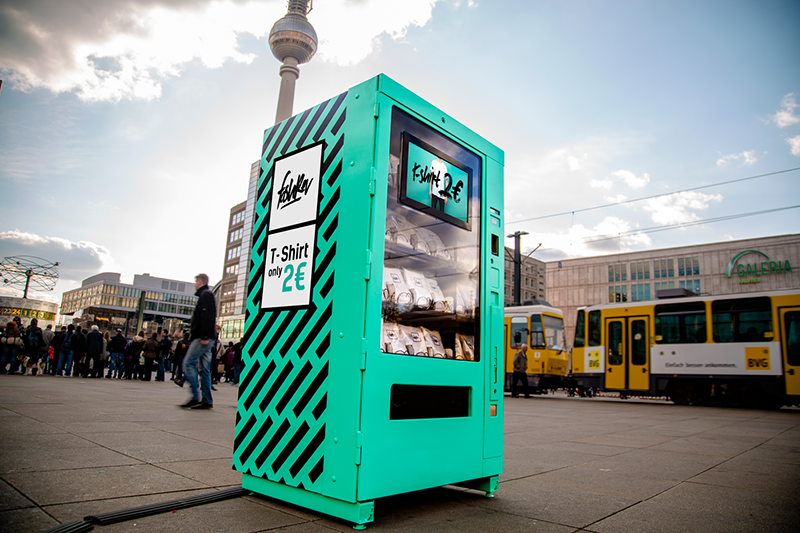
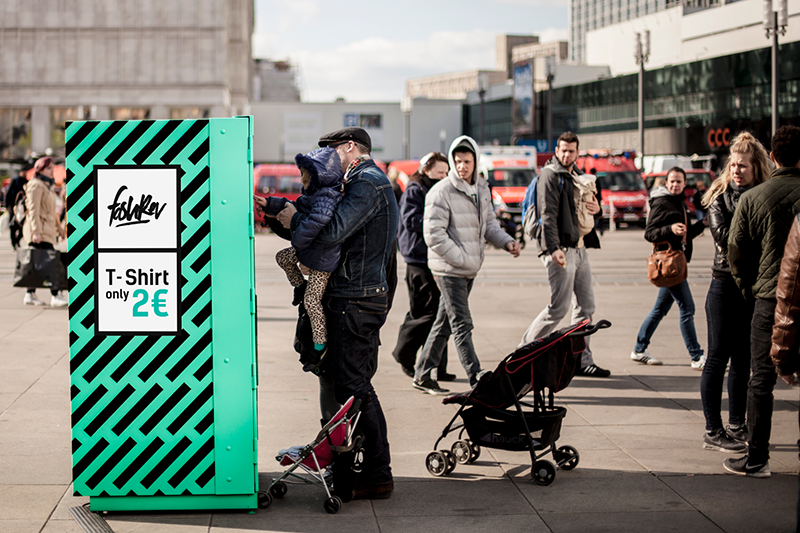
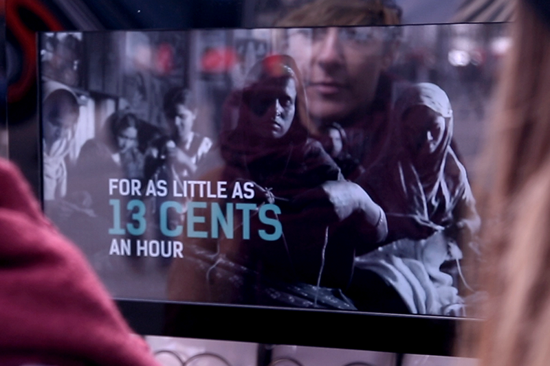
"Berlin, April 24, 2015 – The vending machine standing in the middle of Alexanderplatz in Berlin is a bright popping turquoise. And it promises a real bargain, too: ‘T-Shirt only 2 Euros’. But no t-shirt comes out after the coin has disappeared inside the machine. Instead a video plays on a display, showing shocking scenes from textile factories, where women and children sew without a break. They are paid only 13 cents per hour in addition to working under life-threatening conditions. After 20 seconds an option appears on the display: ‘Buy or Donate’. Consumers are faced with a decision. Do you really want to buy the t-shirt? Or would you rather donate the 2 Euros?"
Another installation design that I found on Behance was this t shirt vending machine. It encourages people to do something out of the ordinary from their day. And also the design itself of the machine is so bright and garish from the grey background of everyday life that it almost beckons people to look at it to see what it does. People would be drawn in by the price of the t shirts but then they are shown what goes on to make these t shirts so cheap so it raises awareness to those who would buy from retailers who support such practices. It encourages you to either buy the shirt or donate it to charity as a result of this video.
No comments:
Post a Comment