Tuesday 27 January 2015

OUGD402 - Studio brief 2 - 11 Steps to a Perfect Logo

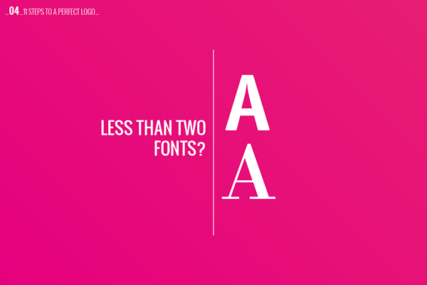
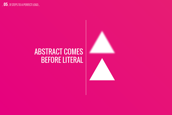
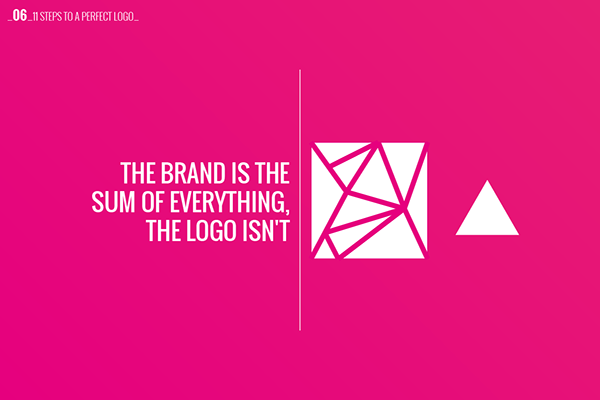
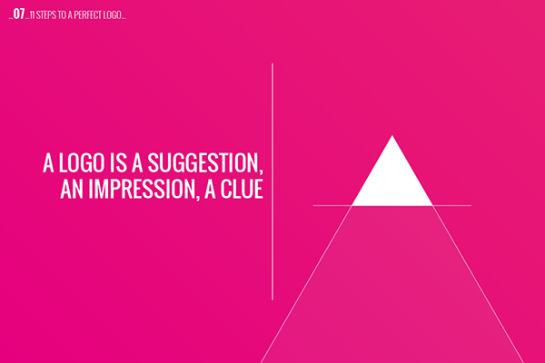
When doing some research for my self branding ideas I came across this guide to create a perfect logo. I find some of the tips quite interesting, such as the fact that the logo is a suggestion of the company - it doesn't have to represent all of what the company is. I struggled coming up with a concept for my own logo to make it unique so maybe I can incorporate uniqueness into another part of my branding and not necessarily my logo. Some of my initial concepts match some of these criteria which I am quite pleased about too. So maybe I should continue with the more simple designs. 


Found here by Borja Acosta de VizcaĆ­no:
https://www.behance.net/gallery/11-STEPS-TO-A-PERFECT-LOGO/12463667

Sunday 25 January 2015

OUGD402 - Studio Brief 2 - Self Branding Initial Logo Ideas

Initially I played around a lot with my initials, seeing if I could combine them somehow or use different shapes to create them like triangles or circles. I also thought of some playful ideas for names instead of using my own name, like something to do with things I love, e.g. biscuits, cats tea. I thought that I could use some nice imagery with these ideas instead of doing a type only logo. I also played a bit with negative space here, combining my initials it made a ribbon kind of shape which I found quite interesting. 

After doing some another negative space design I am quite interested by the shapes that are created with my initials. Maybe I should try with lowercase so that the shapes aren't so linear as I feel like I am not a linear sort of person. I really like the idea of including 'mini-mes' in my self branding to let people get a first impression of me. However I don't know whether this is too illustrative or whether I can get away with it as a graphic designer. 

Initially I tried to create my thumbnails of my two initials combined with existing fonts shown here, which are Bebas and Helvetica. However stretching the W to fit inside the H distorts it making it look patched together and unprofessional.


I moved onto another thumbnail sketch I made inspired by a logo in my monogram logos book and I think that it has worked really well. I drew the logo with the pen tool instead of using existing letterforms. Adding the flash of colour in the circle really makes it pop and I quite like the use of a bold yellow as it portrays friendliness and happiness. I added my name in Futura and I think it works well with the geometric shapes that I have created in my monogram logo.


I went back to my first idea and recreated it using the pen tool and I am very happy with the results. It creates an abstract shape in the counter of the two combined letters that reminds me of a ribbon or a bookmark. I used the colours CMYK inside, as they are the main colours of print which I am very interested in. 


I started playing around with the shapes and text placements. Once again I have used Futura which I think relates again to the geometric nature of my design. I also tried isolating the shapes inside the letterforms into a logo, I'm not sure whether this works on its own and I think that it works much better with the bold black lines as a contrast. 

Saturday 10 January 2015

OUGD402 - Studio Brief 2 - Self Branding Research

Monogram Logos

For my own brand I started by researching some monogram logos as I feel that they are timeless and could be seen as modern at any time. I also like the fact that you can see the character of the person who it is made for through the typeface choice. So first I looked on Pinterest for some initial inspiration. 
I really like the idea of combining both letters of initials into one shape. Here it works really well because they are both curved so they fit into one and other. But if I tried this with my designs I would have to combine the lines as my initials are very linear. 


I like how this design has been framed with the diamond like shape. It fits the shape of the monogram logo really well. Additionally, laying the logo over an image like this could prove to be really effective if I use images of my favourite things. 

I also have a small book which is full of lots of beautifully made monogram logos.


I started by looking at logos that have my initials and I found one that has mine, but it seems very strict and heavy with the serifs and I don't think that this represents my style at all. I like the look of the more calligraphic style in the top corner however I think I would struggle to do something like that because my initials are so linear. 


I love the simplicity of this logo that it is simply the same letter thin and wide. I really like the use of a drop shadow here as it makes it stand out and adds depth to the image. Also overlaying the letterforms in this way frames the logo in a diamond like silhouette. 

Thursday 8 January 2015

OUGD402 - Studio Research - Made Publishers

After finding this journal during my page layout I research I wanted to look into the Studio or artist that created it. I love print design and I have always been interested to try doing some editorial design as I haven't really tried it before now. Made Publishers seemed like the perfect people to get inspiration off for editorial design due to its diverse range of magazines. 

http://aesthetecurator.com/nourished-journal/
http://www.nourishedjournal.com/


I found that it is produced by a company based in Melbourne and New York called "Made Publishers" who produce and print a number of different magazines.


"Founded in 2007 by partners Thomas Williams and Amber Hourigan we produce editions and books dedicated to design, photography, fashion, art, architecture, health & lifestyle." 
I really love their simple, modernist style that they have applied to all their publications, and this is a style that I aspire to use some day as I feel my style can be a little naive sometimes.  


One of their publications known as the "Process Journal" specialises in design and designers. So it would be interesting to have a copy of it to see what type of designers they choose to show case. 

Saturday 3 January 2015

OUGD402 - Studio Brief 1 - Screen Printing


This screenprint was what initially inspired me to create my prints. I found it while attending the screen print induction. After attending the induction I really wanted to have a go at Screenprinting, so me and 2 other people on the course went down to the drop in session in the hopes of creating our own. I felt like I learnt a lot on that day as I could watch people print and apply that knowledge with my own prints. Having never done any screen printing before I was very excited to get started. What I didn't anticipate was how long a silk screen takes to prepare. It required cleaning, then drying, then applying the photo sensitive emulsion and then drying again. And then there was the exposure, more waiting.. Over all it took the whole afternoon from 1 till 6 for me to prepare my screen and produce prints. 

 
Some examples of stocks at the screen print room. I decided that I would print on thick black stock and normal smooth white stock.


Printing set up 


This was my final screenprint. I am really pleased with the results, the gold ink works superbly on the black paper. It even shines in the light, making the speckles look like stars. I also printed some on the white paper which I think works equally as well. 

I plan to create another piece in the future so that I can do more screenprinting as I really enjoyed the whole process. I might try and do some designs onto t-shirts or tote bags and maybe try to sell them on.