
I started looking into applying my logo into some printed materials like business cards and maybe even a creative CV.
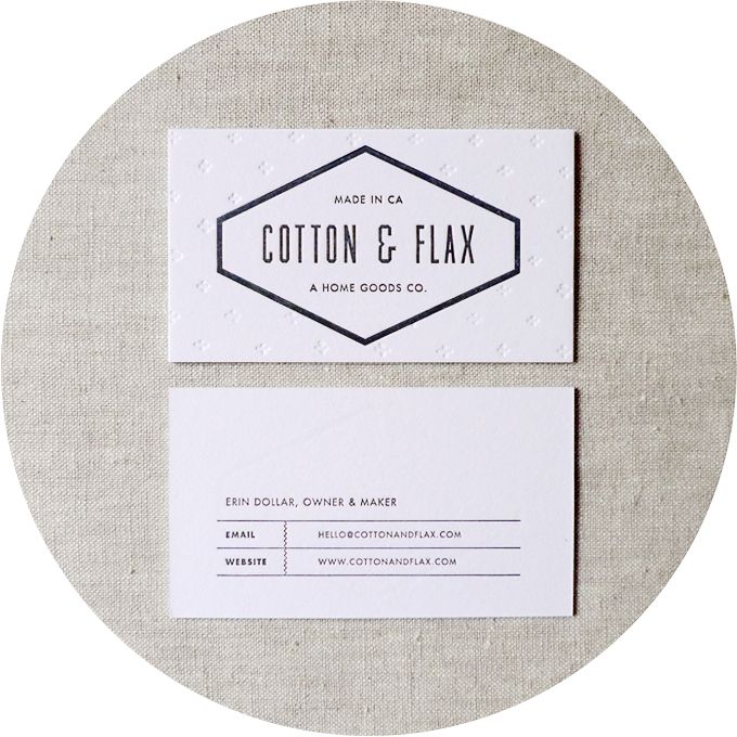
I really like the back layout of this design, it's simple yet effective as it creates lots of empty space to frame the information. I also like how the information given is very simple - there is only 2 contact details supplied, which are probably the ones that people would want the most on a business card. People only really give out phone numbers now if you know them well rather than you have just met. Also the bright shite stock is really effective in portraying a clean look, I can imagine it would be even more effective contrasted against a bright front.

I simply love the use of bold colours and lines within this design. It makes the business cards look almost like part of a cartoon that has been outlined in black. I definitely will try and add a pop of colour in my own designs as I simply can't take my eyes off this design.

Once again in this design a frame has been used around the logo to emphasise the design and draw your eye to it. Also the colour scheme is simple, kept to two colours which makes all of the designs for each element of his brand tie together really neatly and become cohesive.

I really love this idea of having a compact, designed CV of sorts. It means that you could carry them around and maybe even hand them out with your business card. The use of colours and patterns here works well as it creates different textures and makes you want to peak inside. I think that for my practice I will create something similar to this to sell myself further though maybe in a different format such as a small book.
No comments:
Post a Comment